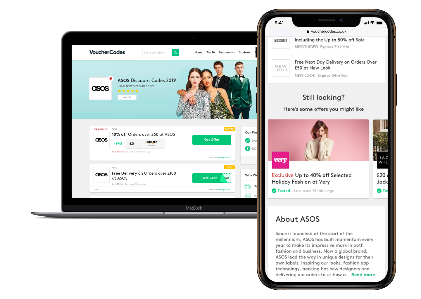
Merchant Page redesign & optimisation
VoucherCodes is a discount codes website and mobile app which provide online and in-store discounts.
It is a SEO driven business, which means a constant challenge against competitors but also being able to adapt to Google algorithms in order to be on top of the search results.
Due to its nature the most important page of the website is the so called Merchant Page, which is the specific brand page.
Most of Users come to VC website by typing "[brand name] discount codes" on search engines and land on the Merchant Page, where all discount codes, deals and sales available at that merchant are displayed in order of relevance.
For this reason this page is of highly importance and needs to be constantly updated: each change and element goes through rigorous user testing and A/B testing before being rolled out.
Goals
- reduce bounce
- increase conversion
- growth SEO SEM
- improve user experience
- create trustworthiness
Limitations
- SEO requirements
- Code of Conduct
Methodology
- Mobile First approach
- Benchmarking
- Ideation (with stakeholders and Users)
- User Testing
- A/B Testing
Vision and KPI's
Improve User satisfaction
- Show them most relevant offers
- Trust in our offers
- Support
Reduce Bounce Rate
Improve Net Promoter scoreIncrease Yield
- Increase Sales
- Safe exposure to their brands
- Create parnerships
Increase Click Through Rate
Increase ConversionImprove Ranking
- Prove our content relevance
- Evidence that VC has authority
- Show value behind our offers
Increase top 20 SOV
Increase Tier A SOVBenchmarking
Card Sorting
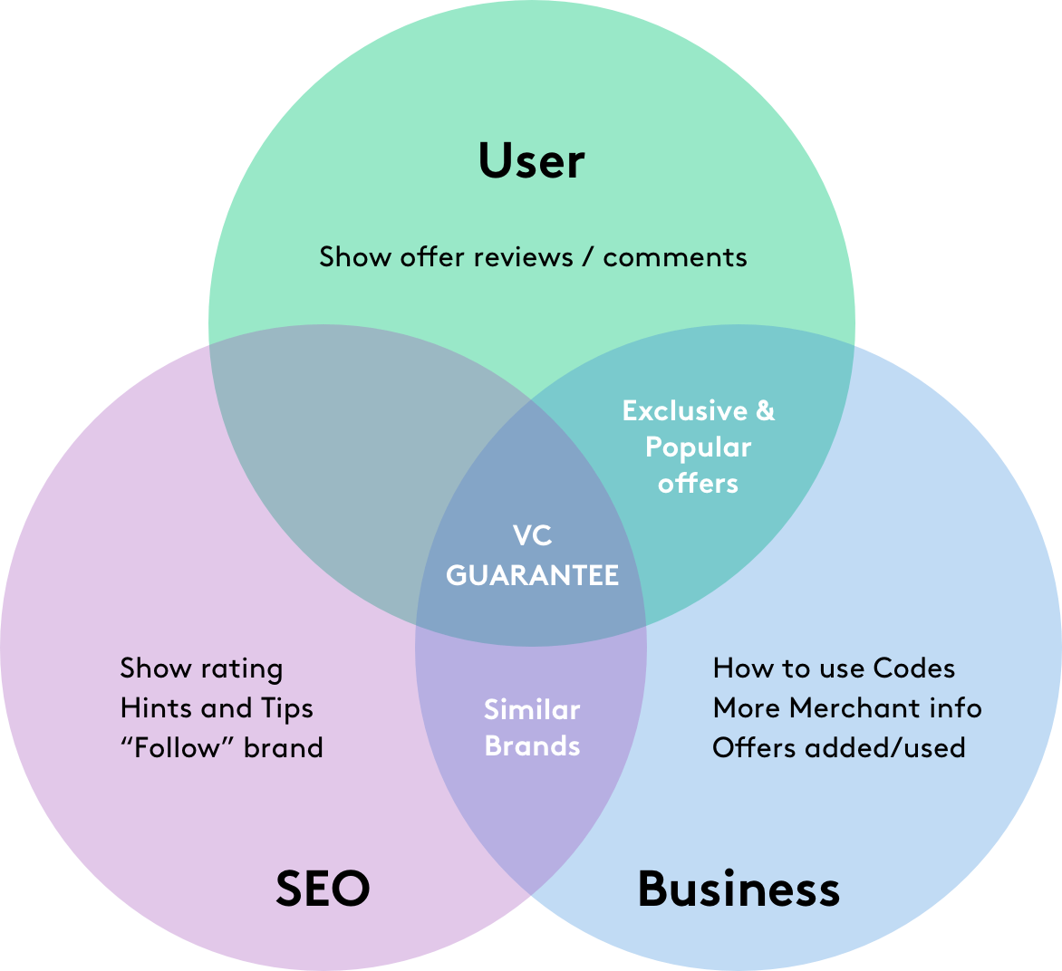
Review qualitative and quantitative data
Click data, heatmap, funnel analysis. User feedback, Customer Support.
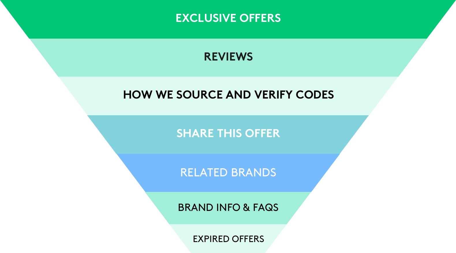
Review content hierarchy
Focus on what matters to Users and to the Business.
Offer Module
Improved EAT by highlighting trust signals at an offer and merchant level as well as adding additional content.

VC EXCLUSIVE
Highlighting that is a VoucherCodes Exclusive offer.
ADDED BY DEAL GURU
Adding a link to the employee page to show personal touch that makes VoucherCodes different from all other competitors.
TESTED & LAST USED
Trust signal that it has been tested by our employees and used by other customers.
ACTION BAR
Removed "Like" because does not bring any value or suggestion. "Comments" are moved to a page level. Introduced "Share" to help more people saving.
UX and Visual changes + page optimisation
Design a page that delivers users the best savings in a way that reflects our brand and values.
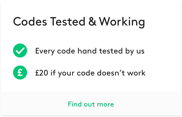
Show transparency and value in our offers. We are sure to have the best offers.
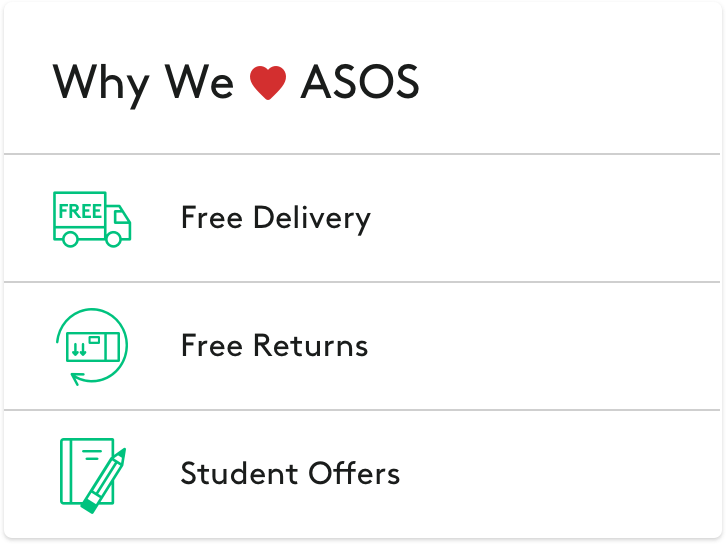
"Why We Love" is a new way to enhance the brand services.
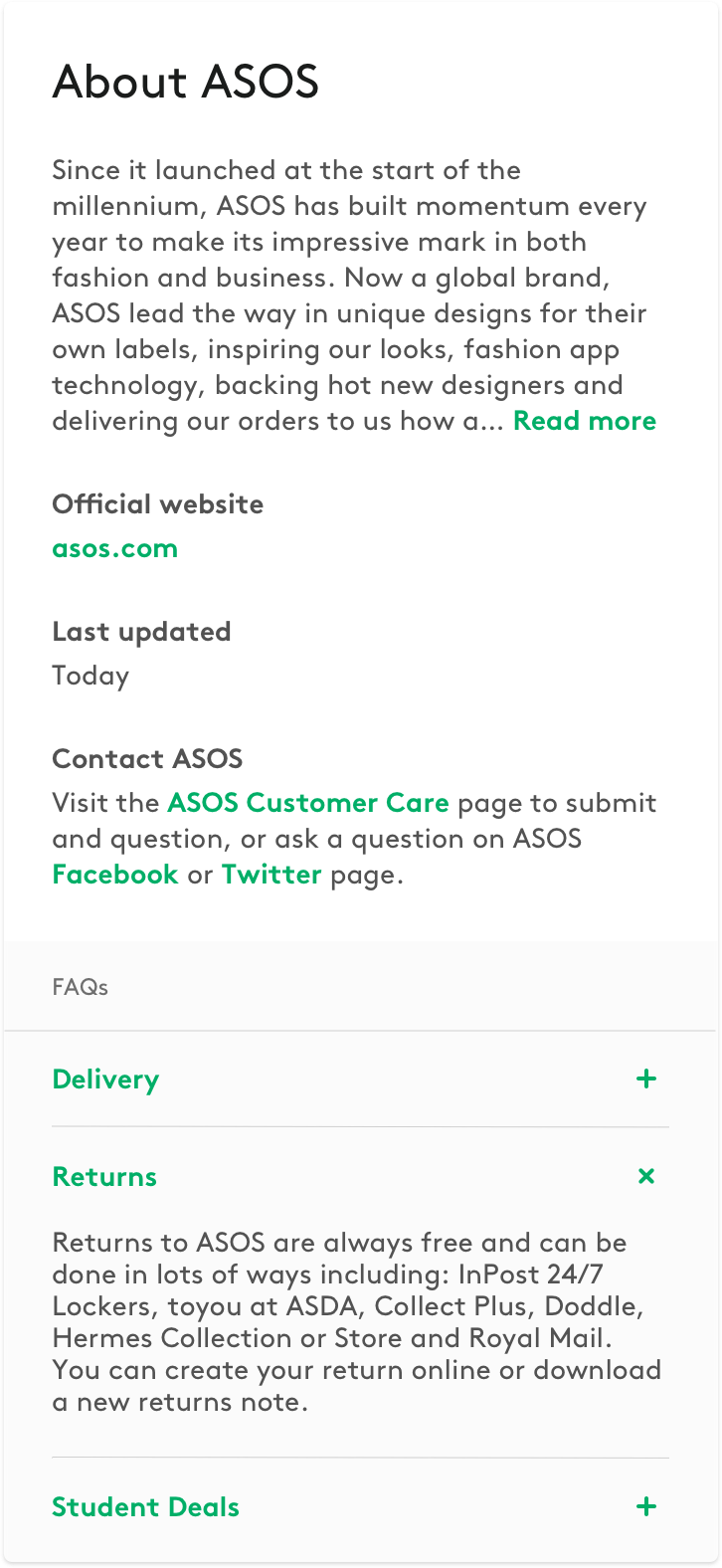
The FAQs section provides useful information to Users and also increases visibility within search results.

"Still looking?" Enhance UI in some modules to increase engagement and break up the content, offering the User different suggestions but still related to what they are looking for.
New sign up which appears at the bottom of the screen to create a more dynamic experience.
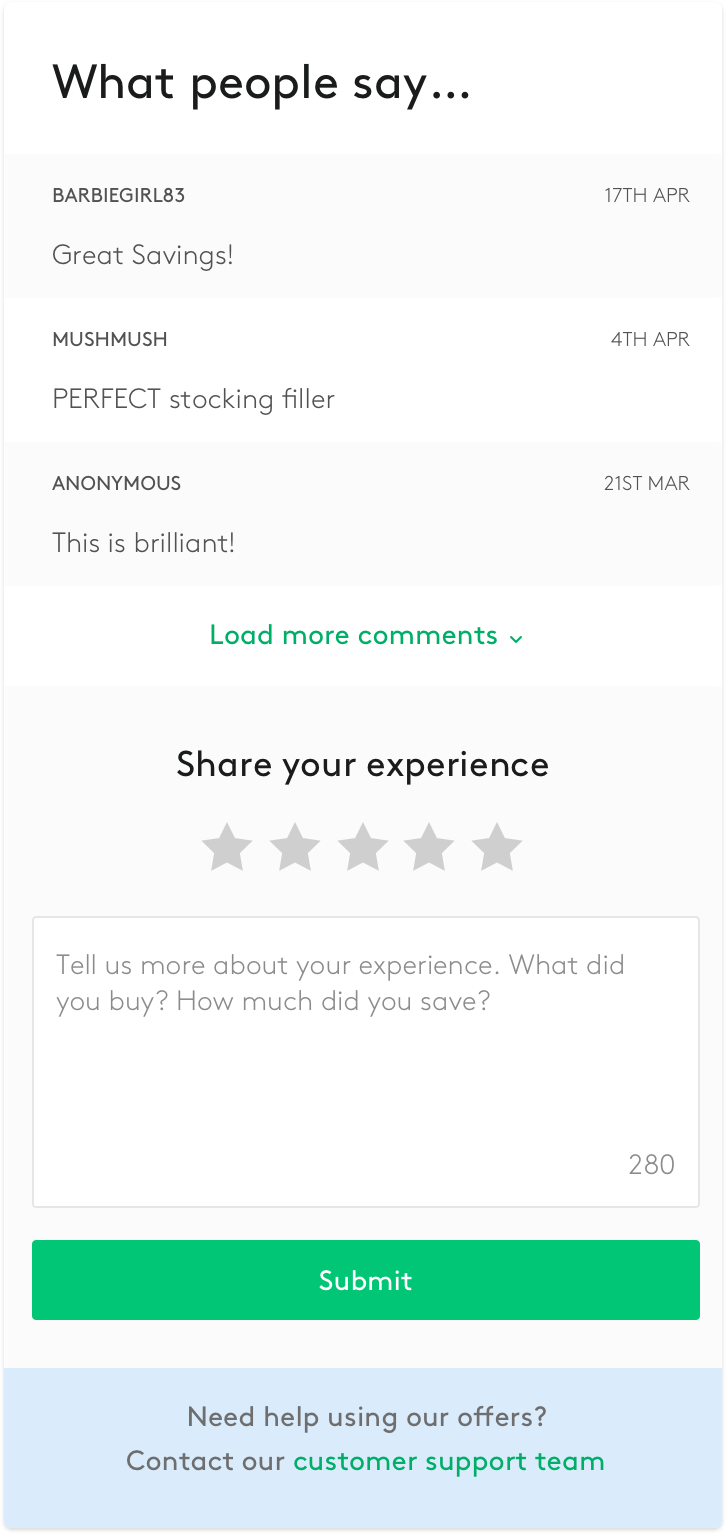
More value to user reviews. Having comments on a specific offer means that most of comments will be related to the code working or not, and once the offer is expired the comments will disappear.
By having the comments as a separate section will push users to review their whole experience with our offers and the brand itself, also those comments will always be visible, adding more value to customer reviews.

"How we source and test codes" A quick video of our amazing office and meet the face behind our offers. Value of our brand, human touch,
Offer module tests
Some examples of the offer module AB tests
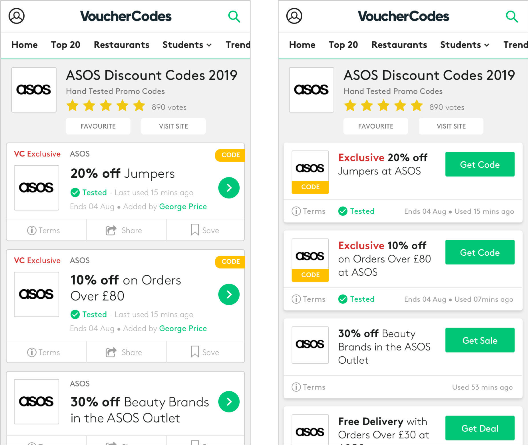
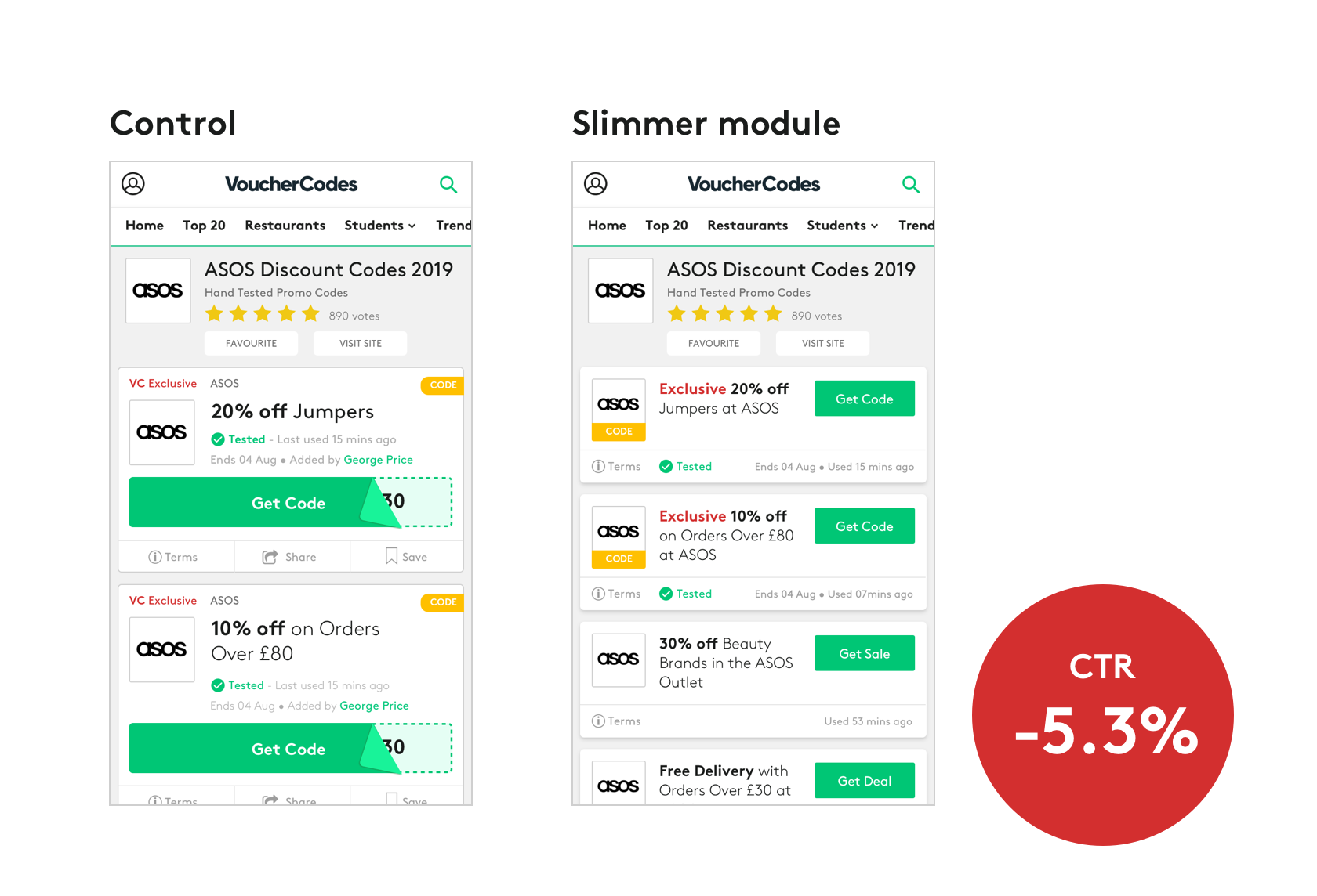
Mobile optimisation tests so that more content is visible when Users land on the merchant page. Slimmer offer module, header and CTA.
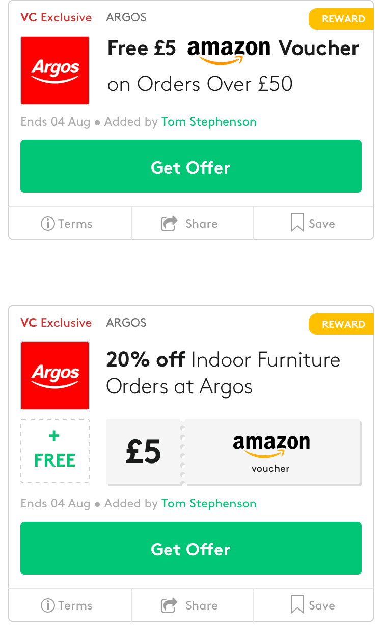
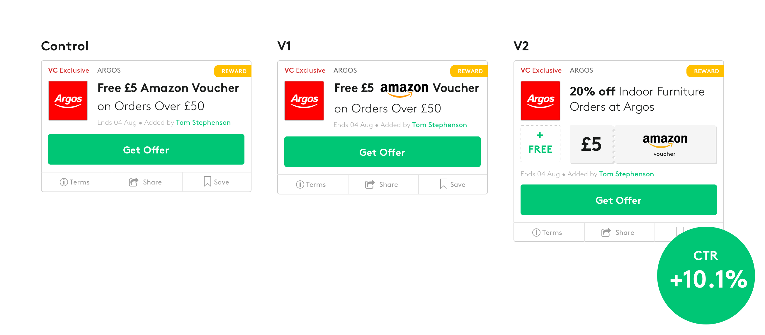
STAX Stackable offers, combining offers and rewards.
Page evolution over 12 months
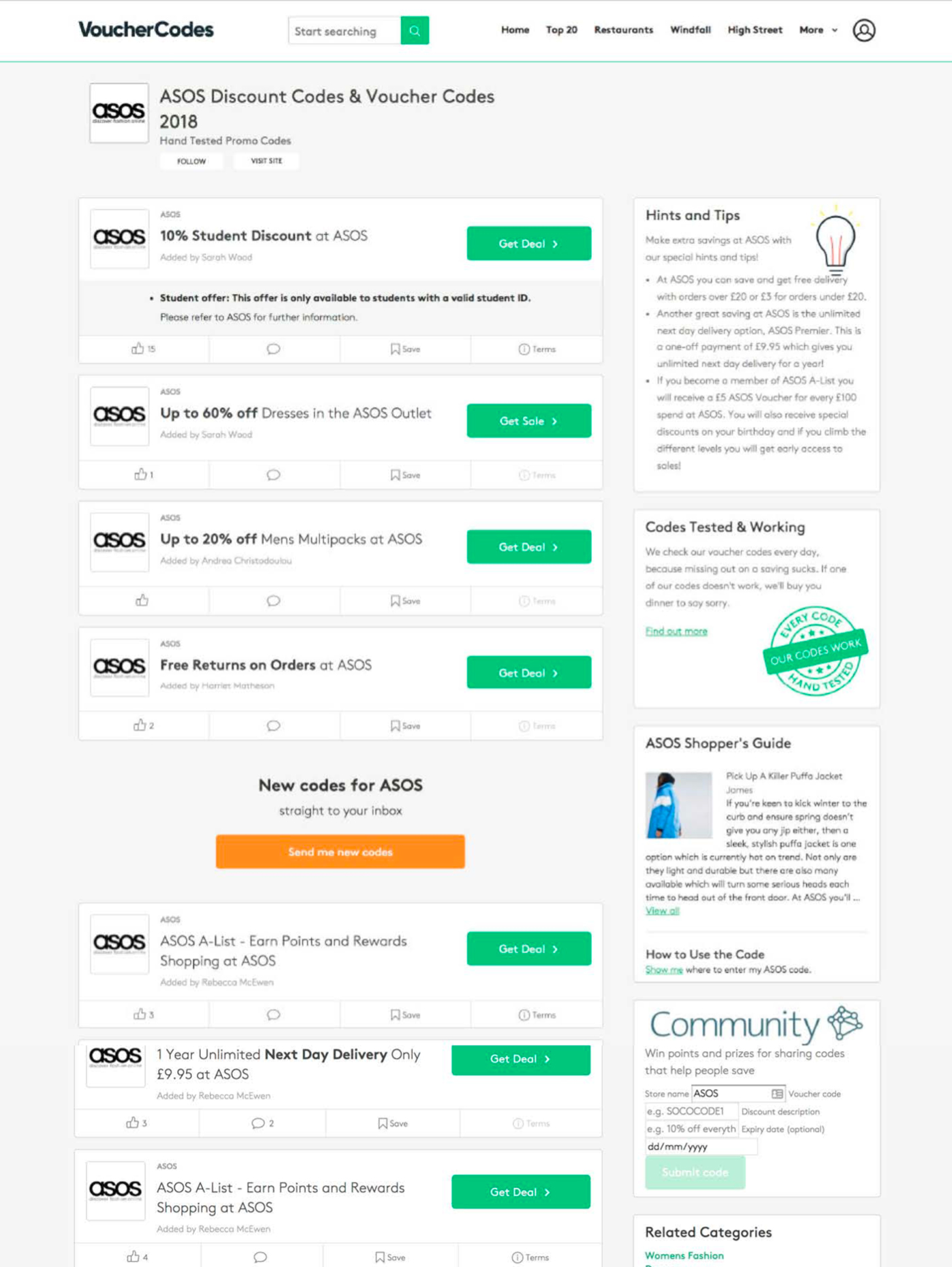
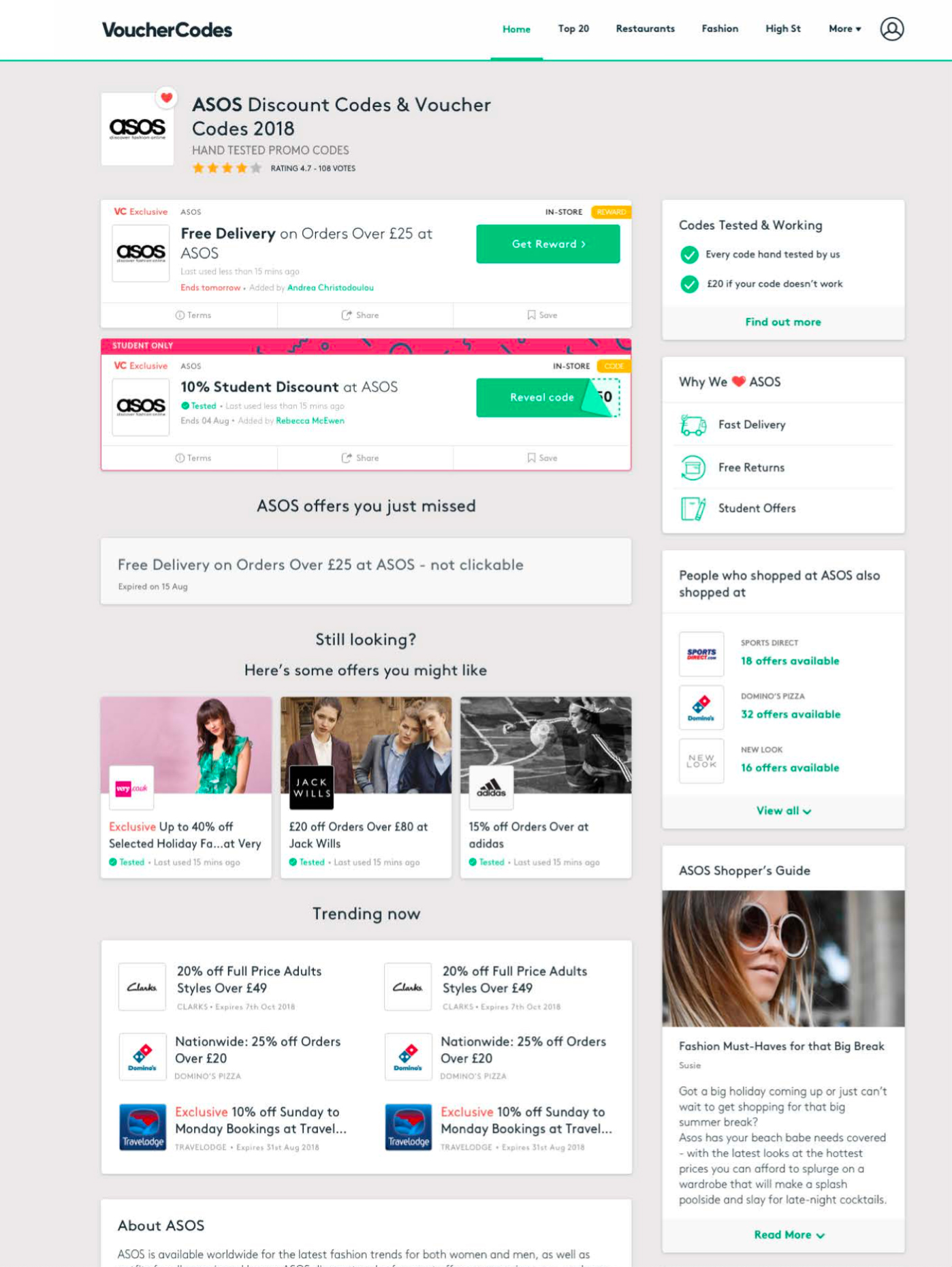
Test & Learn
Offer Module iterations
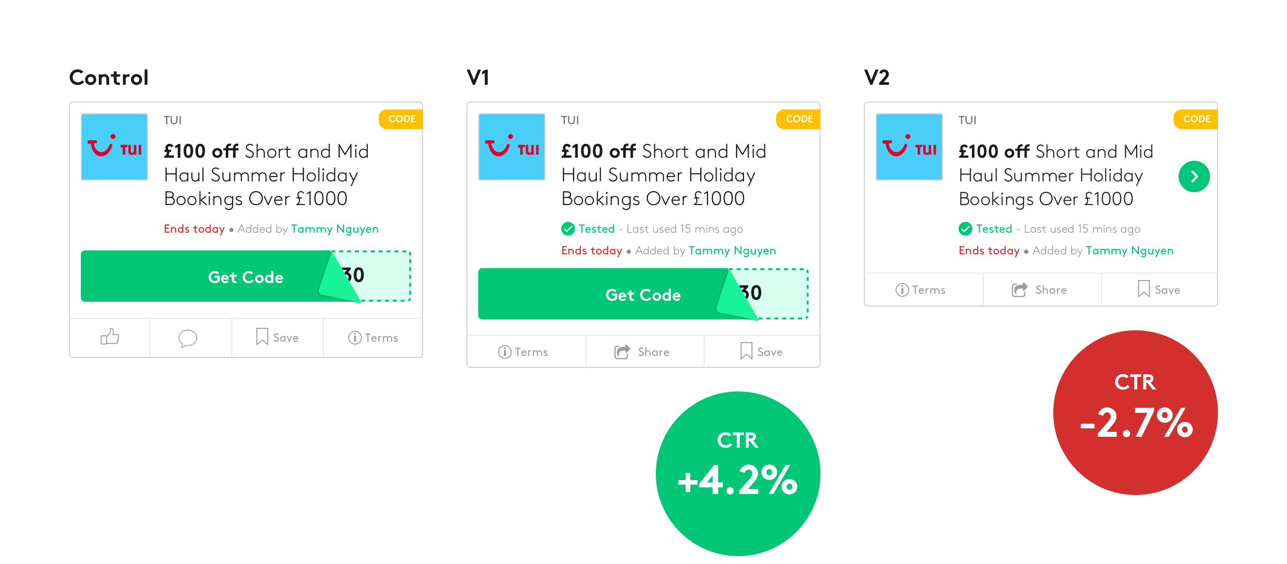
Slimmer offer module
STAX - Stackable offers
Moving forward
STAX
Has been a big winner and a new more powerful way of displaying reward offers.
SMART DEALS
Showing items in the sale will attract users better than a simple offer.
SIMPLIFY THE OFFER MODULE
Reduce the amount of information down to what really matters and has real value for the customers.
